Logo Design Checker
A great logo looks professional on a shop wall, but digital media often brings these challenges:
- Too Small: Details become blurry when scaled down (e.g., Browser Favicons).
- Circle Cropped: Social media avatars force circular cropping, often cutting off essential parts.
- Visual Clashes: Logos can "vanish" against different app themes, backgrounds, or dark modes.
Use this tool to preview your logo in extreme environments and ensure your brand recognition.
Drag and drop your logo here, or click to upload
Browser Scenarios
Instagram Post
LINE Chat
LINE Friend List
Discord Server Icons
Crop Threshold (1:1)
Logo Design Considerations
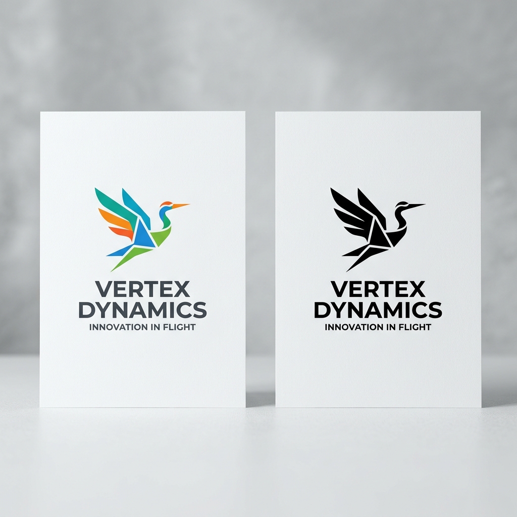
1. B&W & Monochromatic
A successful logo must work in pure black and white (printing/etching). Avoid relying on gradients to define shapes.
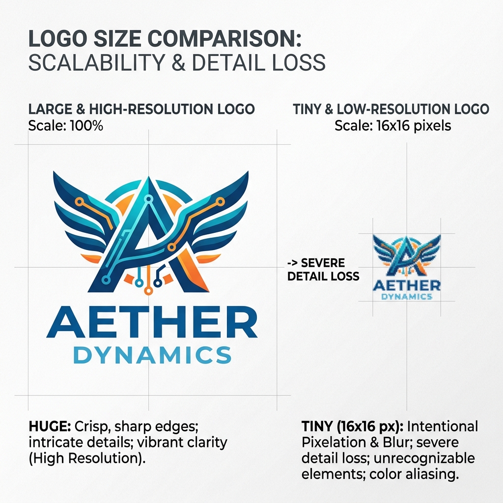
2. Scaled Recognition
Test down to 16px. If it gets messy, prepare a simplified version for browser tabs or app icons.
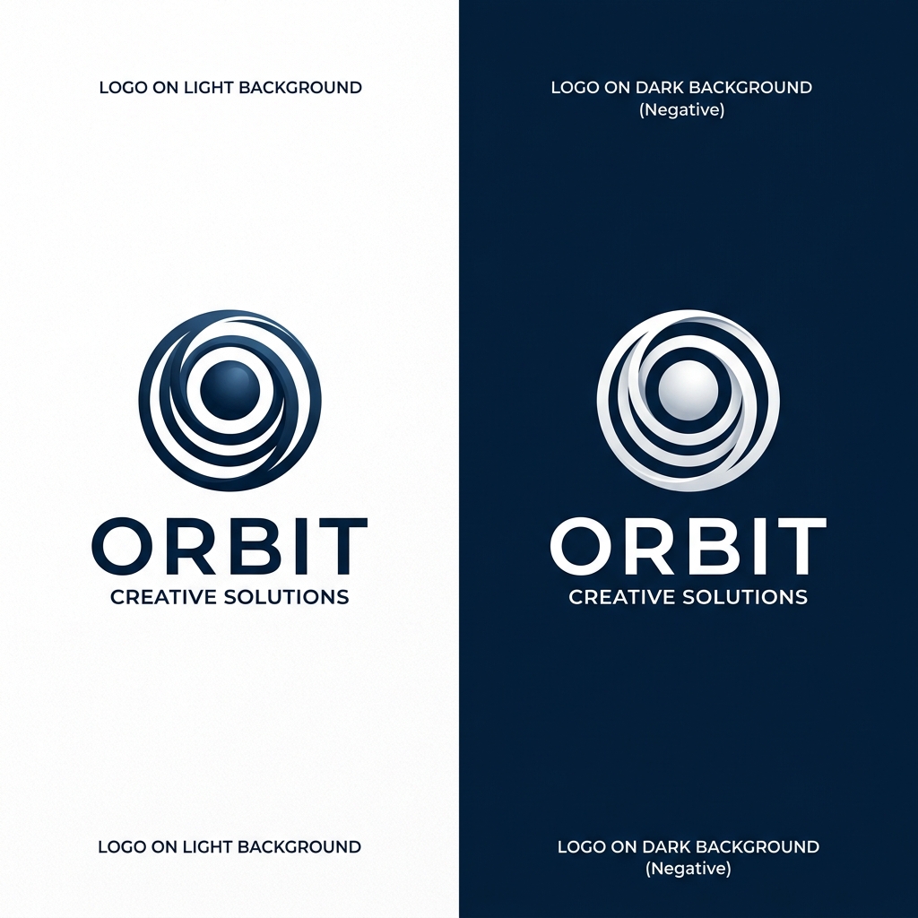
3. Contrast & Adaptation
Ensure your logo has contrast on both dark and light backgrounds. Provide a negative version if needed.
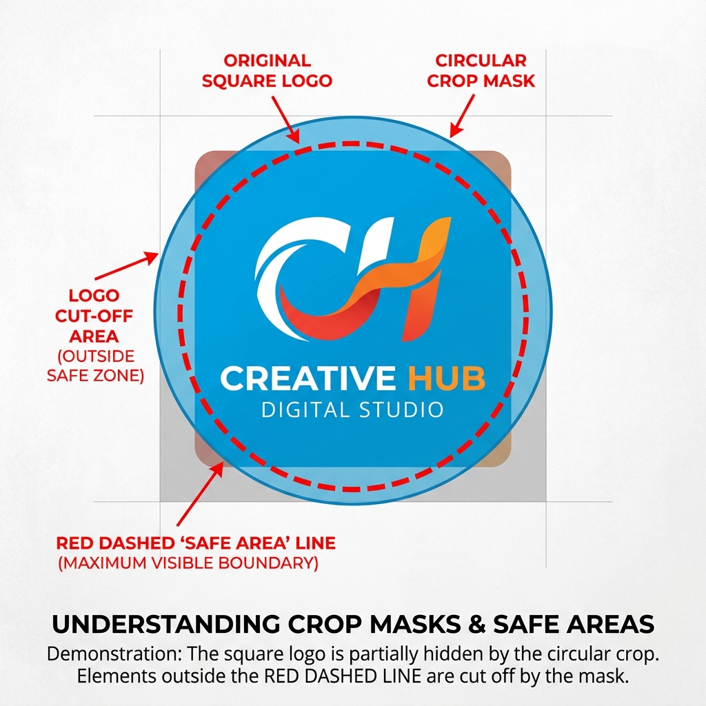
4. Safe Margins & Cropping
Modern apps often crop avatars into circles. Keep your core design within an 80% inner circle to avoid cuts.
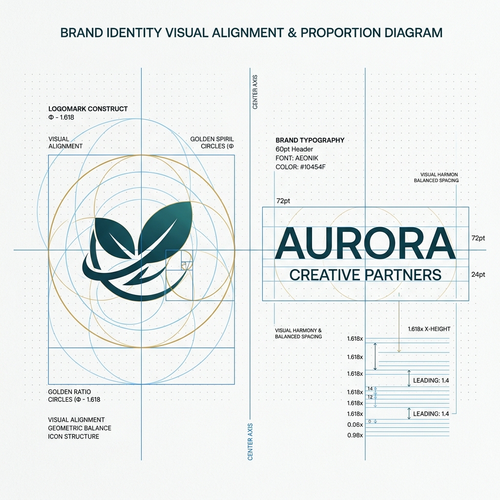
5. Logotype & Proportions
Visual balance between icon and text is key. Ensure the icon doesn't overpower or get lost next to your brand font.

6. Trademark Search & Legal Risk
Your creative concept may unintentionally match an existing registered trademark. Always perform a trademark search before finalizing to avoid legal conflicts caused by similarity to established brands.
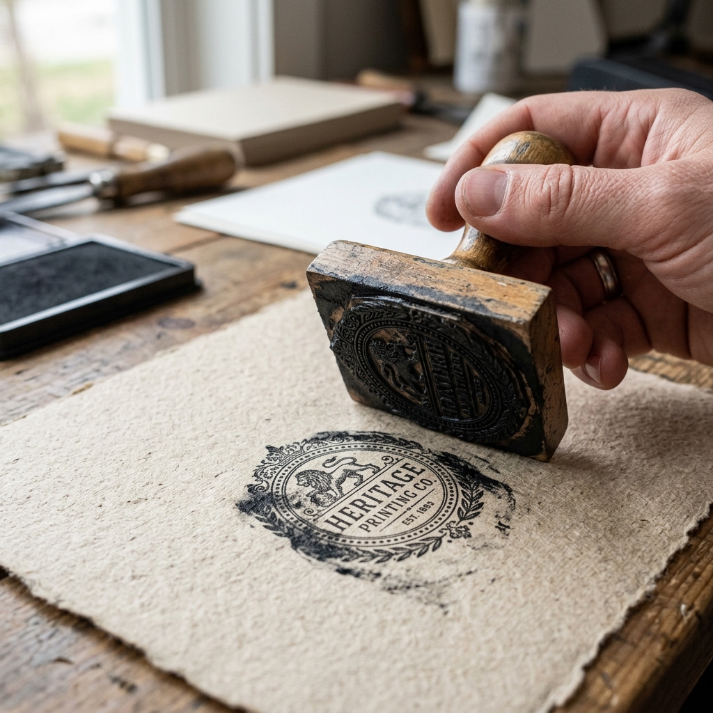
7. Physical Media & Stamps
Test for rubber stamps, embossing, or embroidery. Fine details smudge in physical media; prepare a bold version if needed.
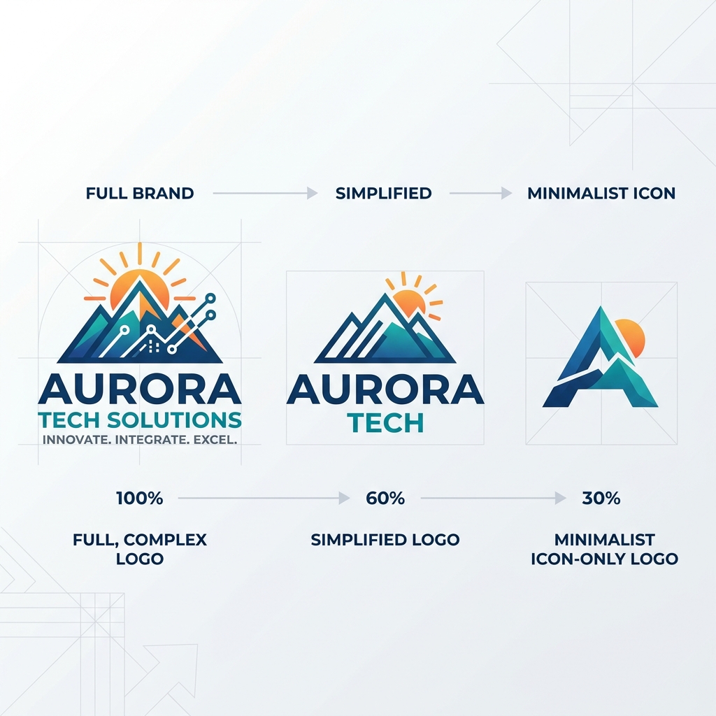
8. Responsive Logo System
Smart brands use responsive variants. A full logo for websites, and a simplified minimalist icon for app heads and notifications.
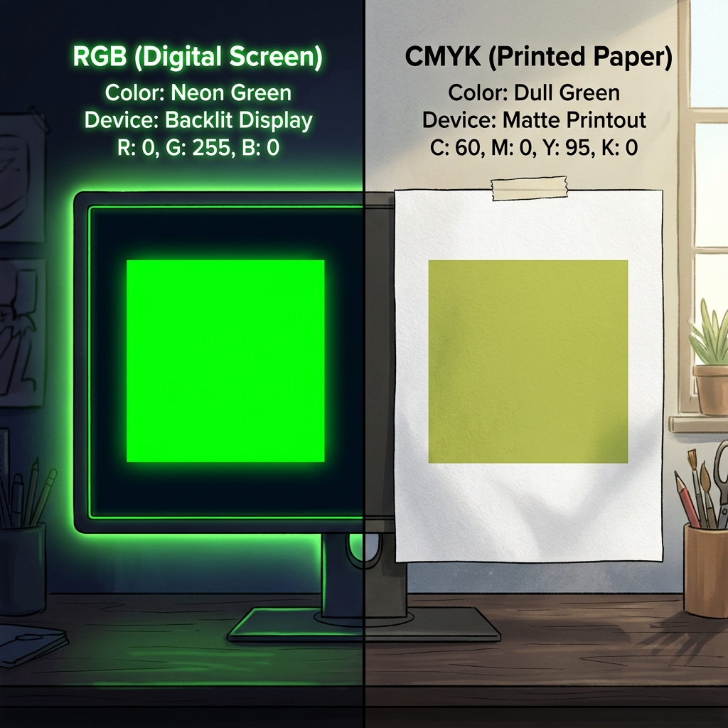
9. Color Gamut (RGB vs CMYK)
Digital screens (RGB) show more color than print (CMYK). Avoid neo-colors that will look dull and washed out on paper.